Work statement
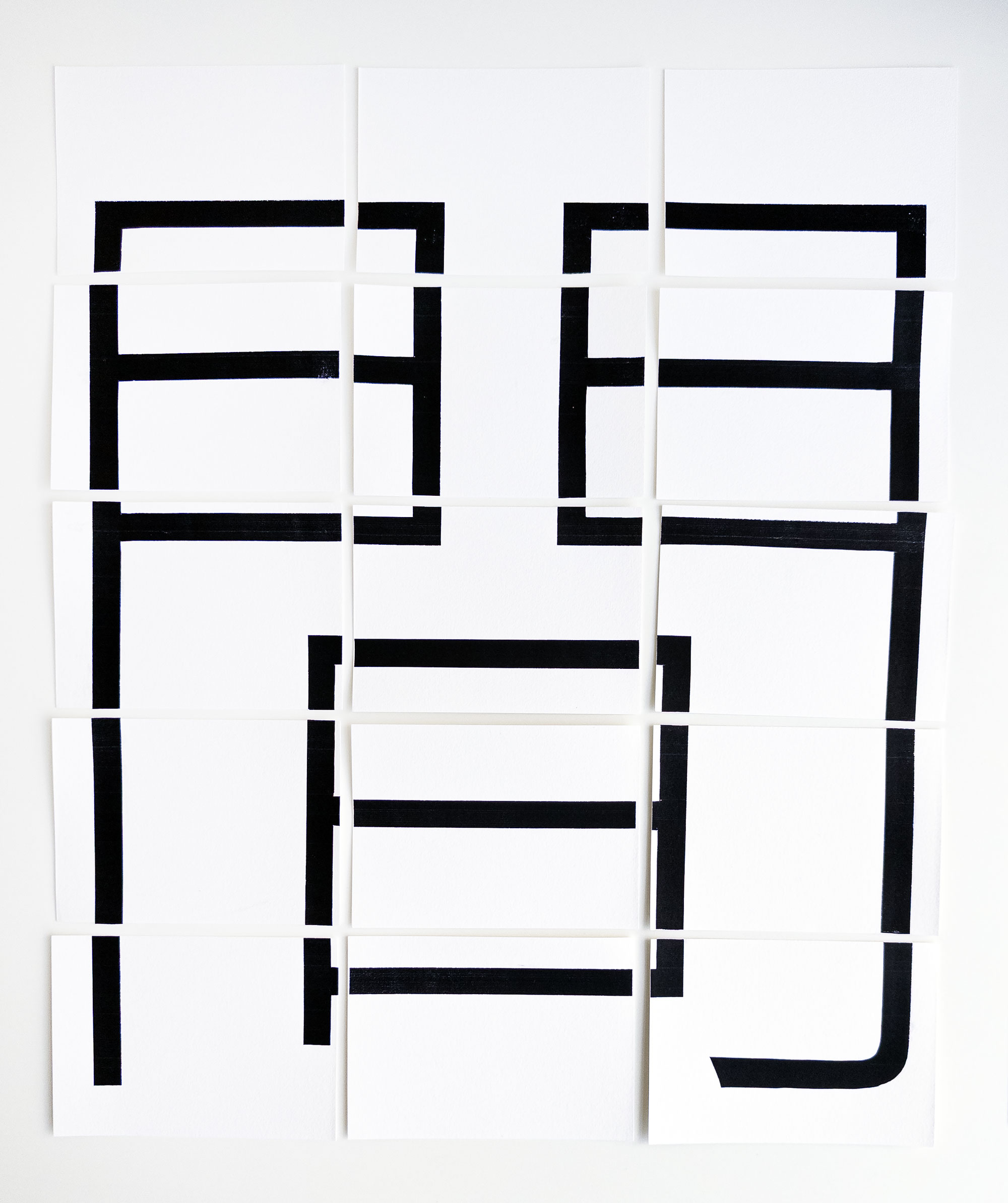
The character ma (間) represents a Japanese concept that values empty or negative space as much as the presence of things. As a designer, I understand the importance of negative space in graphic design. After all, the empty area around a text or illustration makes it stand out. You can extend this perspective to architecture, as the Japanese do explicitly, to music or even communication itself. As I stated in my first project, “Spread the word”, the spaces between words in a sentence are indispensable for a text to be readable. Silence is golden.
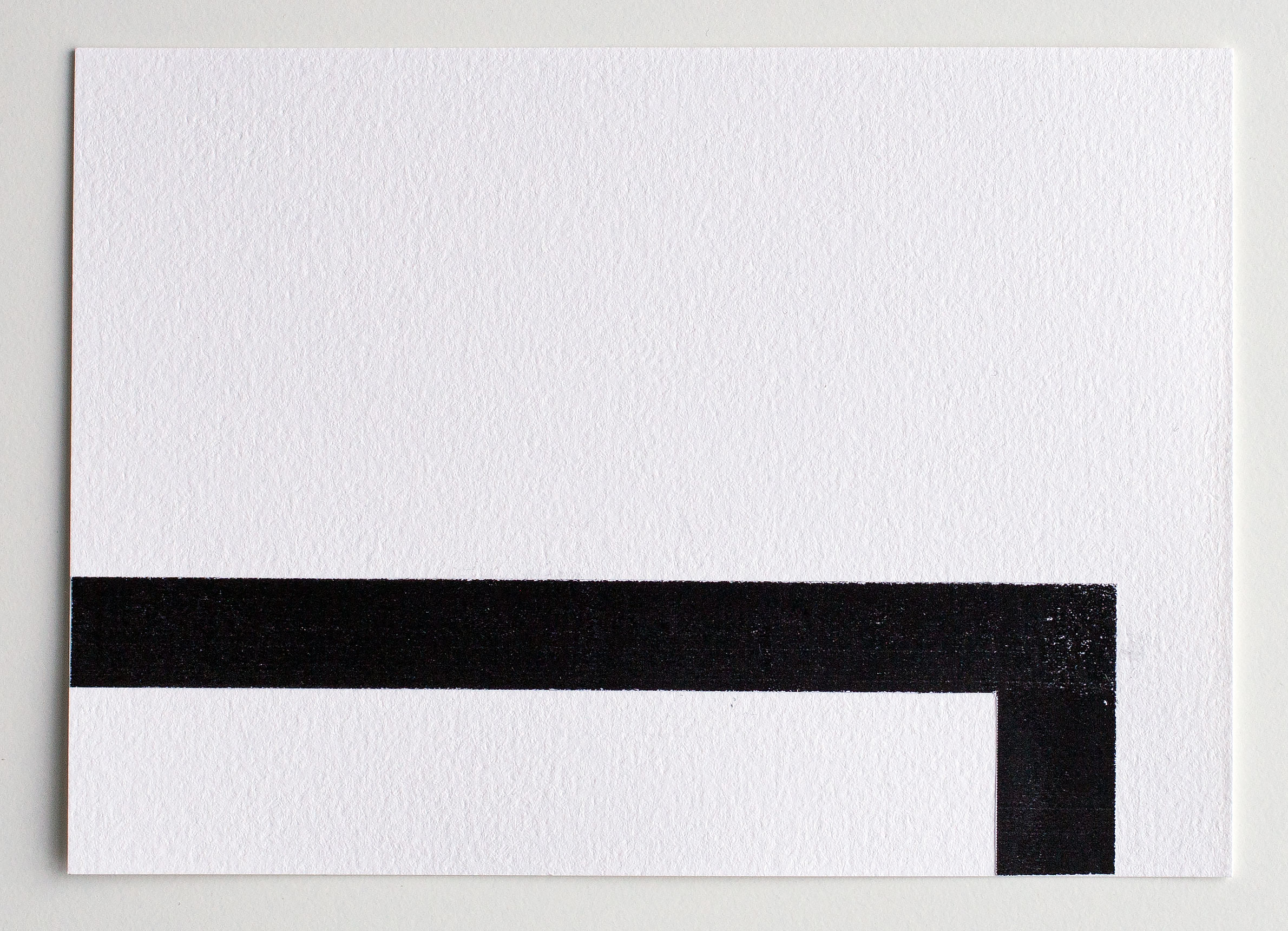
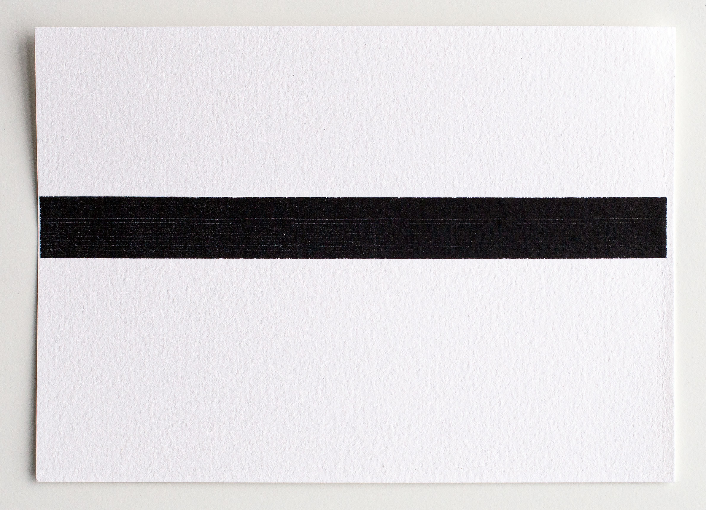
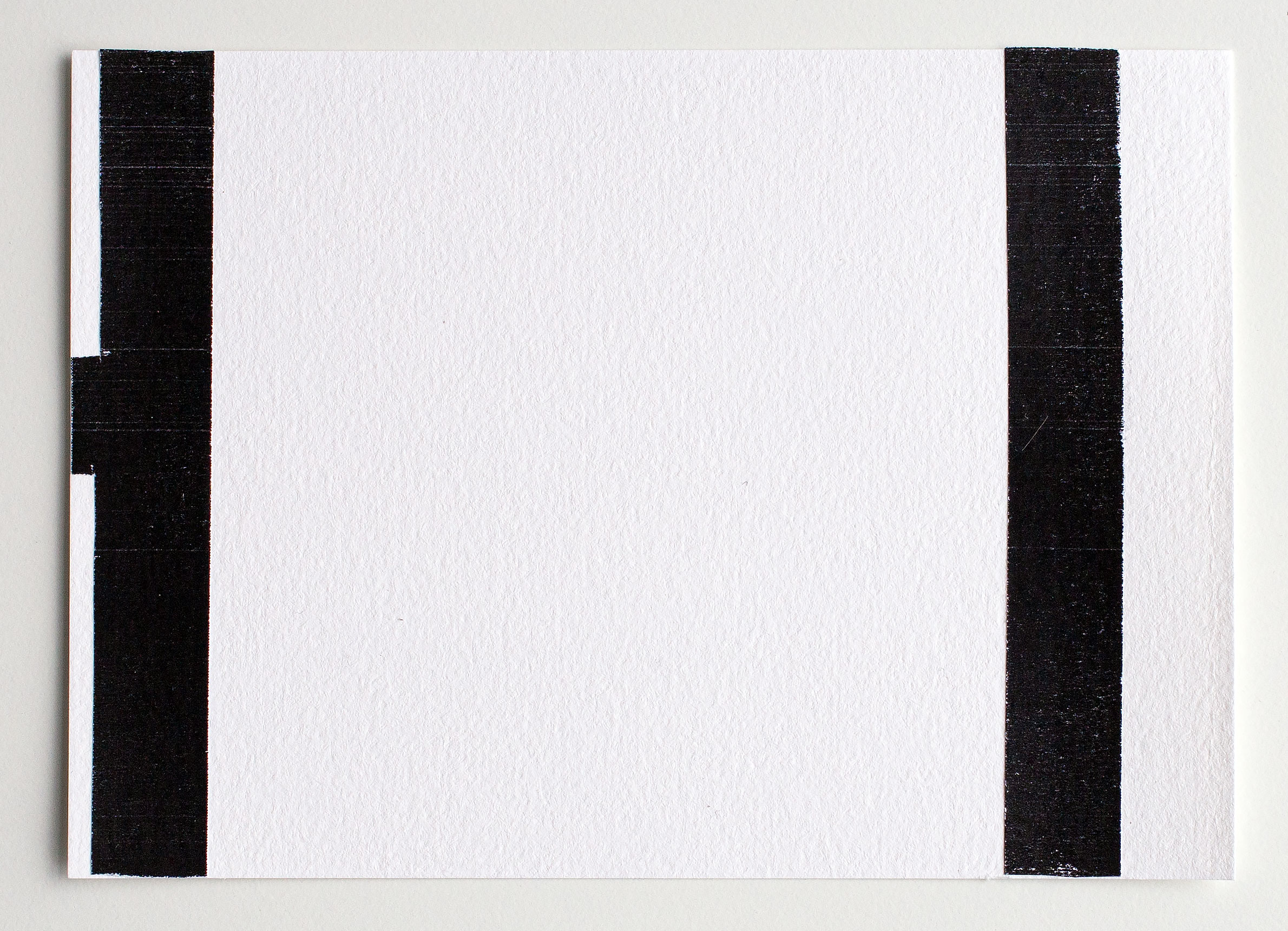
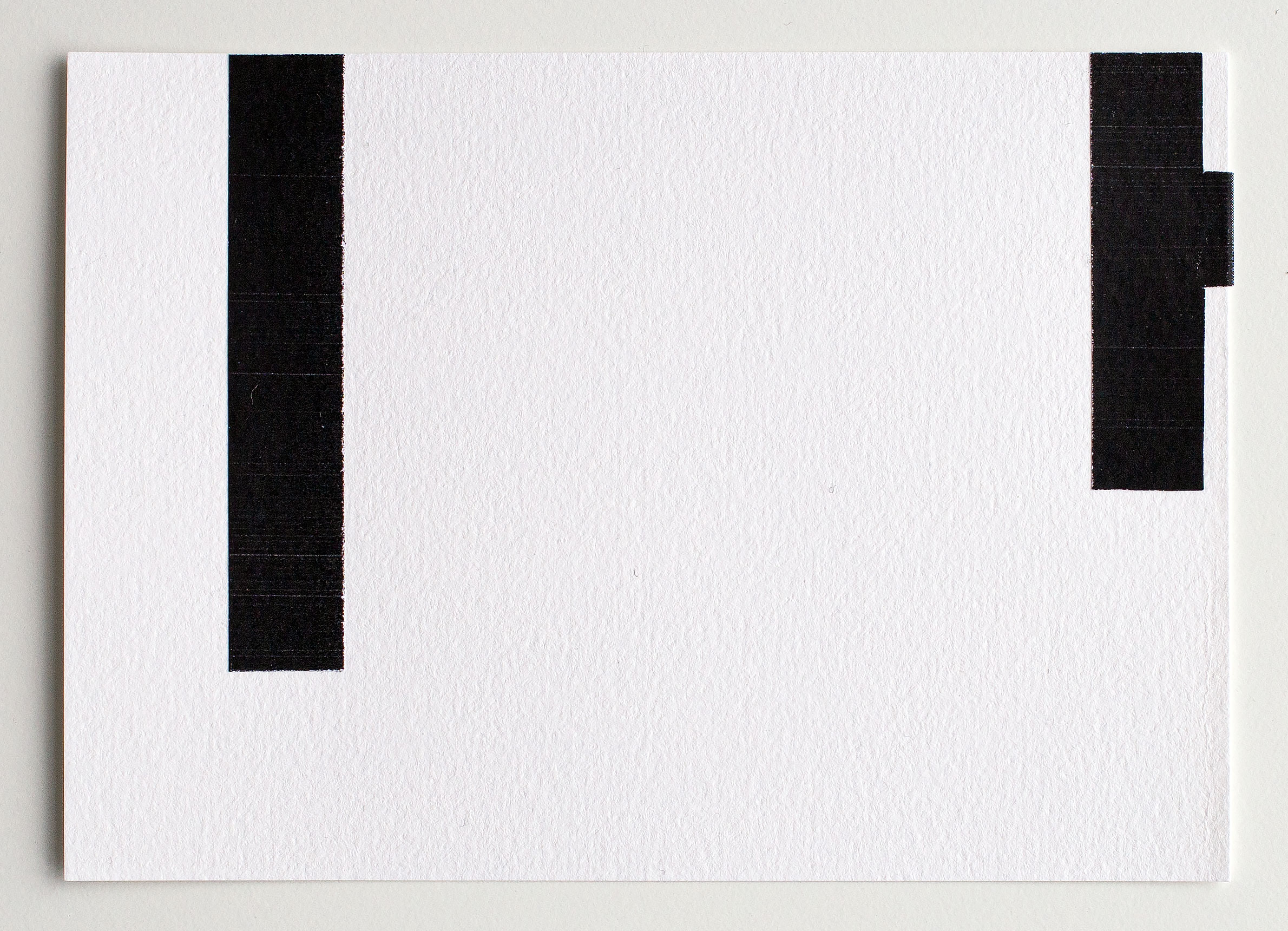
Transferring the idea of ma into mail art seems obvious to me. In my projects I inevitably create negative space: the gaps between the individual postcards on my desk. Deconstructing and spreading the kanji across 15 cards doubles the meaning of negative space. There are gaps and there are only a few areas on the postcards covered with fragments of the character. This approach is pushed to the ma x when the postcards are shipped to different countries, the negative space between them expands immensely.